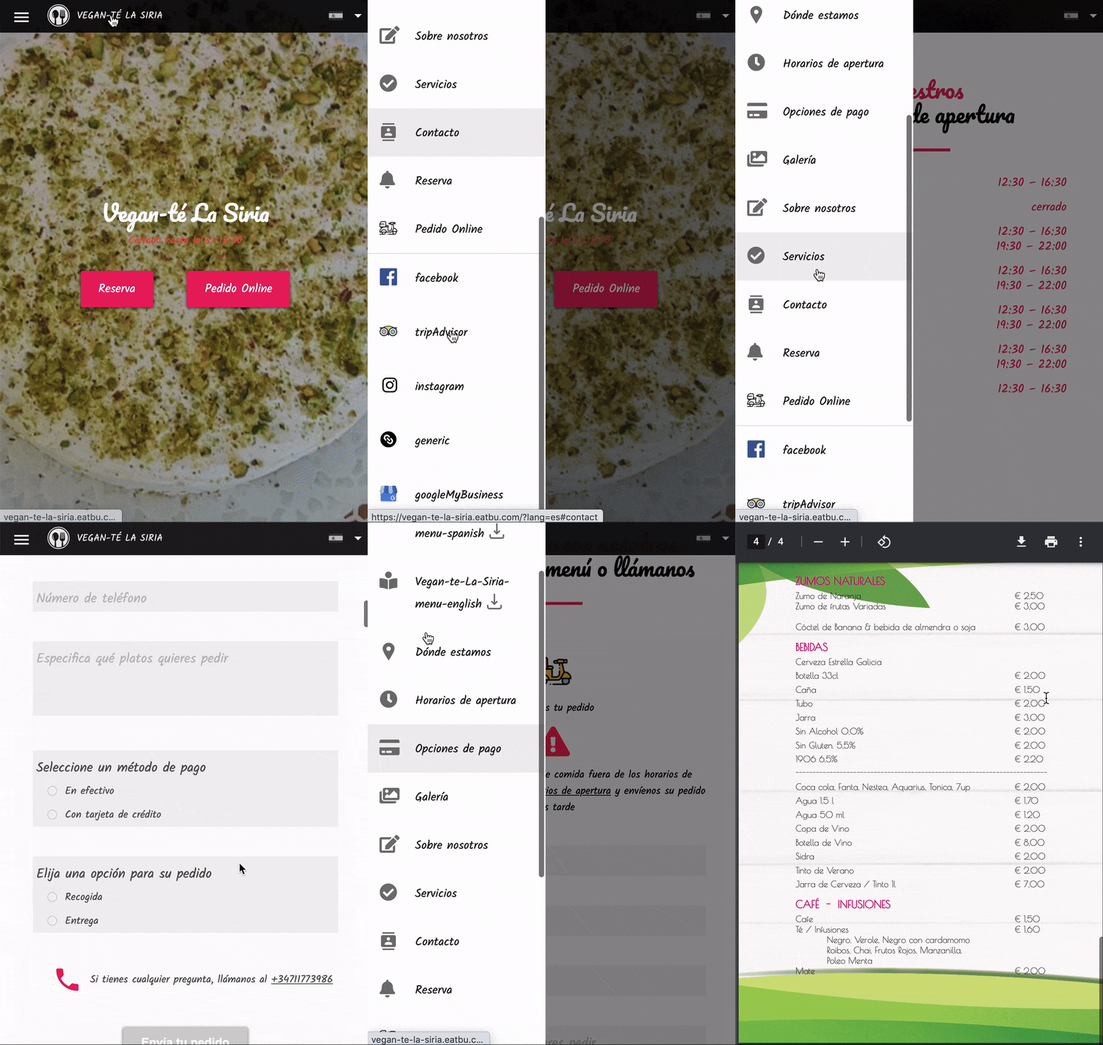
Vegan-té La Siria_
Why fixing what ain’t broken?
Because there is always room for improvement
Let’s see how the website of this Malagenian restaurant can benefit from some good old Ux/ui Design
A one week project to redesign a responsive website for a small business using information architecture, branding and responsive layout technique to make it more attractive but above all else, more intuitive and user-friendly
Where do we start?_
To fully understand where improvements were needed I evaluated the current site, how? With a content audit & visual evaluation
_Content Audit
The objective of the content audit of the current site was to gather all the information the website displayed to look for duplicates, bad structures & understand brand values.
Having all of this information in front of us, we could start thinking about how to better prioritize the restaurant’s business goals with information architecture and clear site navigation.
_ Site Content
Who is Vegan-Té La Siria?
Vegan
Fresh food everyday
Friendly / homely / cosy
How is their current website?
Unclear messaging & CTAs
Overwhelming navigation
Garish branding (not matching their food / restaurant)
How did we restructure the site?
Business goals, users’ mental models and brand values were the basis for reorganizing the site’s structure.
_User’s Mental Models
We split up the content from the current site into separate elements of information and allowed people to group the content as they felt made sense to them using a process called card sorting (open & closed card sorting). This approach uncovers users’ mental models for better information architecture. This gave us 5 main categories: about, menu, services, delivery & contact.
_Business goals
With those 5 categories in mind, we then prioritized them against business goals.
What are the restaurant’s key business goals and how could a new website design support these objectives? Keep reading to find out.
_Brand values
With an idea of site structure through auditing the content, grouping similar elements and then prioritizing those categories based on business objectives, we then began thinking about brand messaging.
Whos is Vegan-Té La Siria? We wanted to deconstruct their promise to their customers in order to authentically communicate it.
We decided on primary brand attributes to develop the visual design with: approachable, healthy, fresh & light. We used these attributes as goals for how we wanted the users to associate with & think about the brand.
What are the restaurant’s key business goals and how could a new website design support these objectives?
_OPPORTUNITY 1
Provide fresh
delivery food
Problem People looking to an easy / accessible alternative to cooking at home
Solution Accessible, quick and easy-to-use delivery option
KPI Number of deliveries ordered
_OPPORTUNITY 2
Having more clients going to the restaurant
Problem Business boost needed from people coming to eat post Coronavirus
Solution Effectively & authentically communicate brand identity & messaging
KPI People contacting via the site
Having deconstructed and realigned the content of the site to business goals we solidified a problem statement to have in mind when progressing further with the design — getting the users to interact with a design to support reaching business goals
How might we streamline the process of ordering food from Vegan-Té and allow people to understand who they are?
From the insights in the user interviews, we developed some specifics about who this website & restaurant is serving.
Sara is a user persona: a fictional figure to have in-mind as a representative of the user (traits, behaviours and patterns of a bigger body of people).
“It is all about next summer. This year does not count”
Adidas sneakers, jeans and a Fjallraven backpack are her go to outfit.
Sara loves eating in restaurants since she’s not a very good cook. Sharing trips and meals with her friends is one of the things she enjoys the most.
She used to go to this little vegan place on the weekends but now she can’t because of lockdown. What was its name?
Before going into some key highlights of the process, best you have the final thing in mind.
We invite you to explore the delivery options of Vegan-Té also for desktop and add some tasty fatte and hummus to your cart.
Make sure you’re in full screen — enjoy!
“I remembered this place I used to go before the quarantine. I would give anything to have a good plate of fatte now. I wonder if they have some kind of delivery service…”
Sara knows all the vegan restaurants in Malaga but due to the lockdown she’s missing her favourite places.
Reminiscing about the tasty food, she’s reminded of the delicious fatte they have at this place called Vegan-Té. She jumps online to see if they have online delivery
Hey, don’t forget to check out the desktop version as well.
We invite you to explore the delivery options of Vegan-Té also for desktop and add some tasty fatte and hummus to your cart.
Make sure you’re in full screen — enjoy!
With a problem, a goal and an user, what were the steps to get from A to B?
Initial stages
Navigation & site map (using card sorting)
Understanding business goals and prioritizing the content dependent on it
Brand attributes & initial visual pathways (with style tiles)
Mid stages
Experimenting: visual pathways with site content in layout
Deciding on elements to move forward with and iterating with that
Testing the desirability of of the design
Final stages
Finalising design details (both mobile & desktop)
HTML & CSS of one page
Prototyping
After putting the design to the test, we drew the elements we found worked well and aligned best to the messaging we were going for and settled on the following brand elements
Here are the key changes our design went through and the reasons why
Change made
Order of navigation options
Reason
Prioritizing business goals
Change made
Primary background colour from coral to white or grey
Reason
In-line with brand attributes: healthy, vegan & fresh
Change made
Rid contact page
Reason
Not useful, doesn’t aid the user, instead clear calls to action (business goals in mind)
Because desktop and mobile versions are equally important but also very different
Key changes
Primary navigation
Horizontal top nav in desktop, hamburger menu in mobile
Delivery & Menu interface
Tabs on desktop, accordion drop-down on mobile (no scrolling, succinct user experience)
With our redesign, we wanted to see if we were achieving what we set out to with the brand attributes and so we conducted some desirability tests which results were very much in-line with what we wanted to achieve
Next steps
Run usability tests to evaluate the success of our design
Offer the webpage to the restaurant to use
Key learnings
Power of card sorting & desirability testing to validate design decisions
The importance of aligning design with business goals


